Rachel and I went to the Toronto International Art Fair, recently aka Art Toronto, on Friday and it was amazing as per usual. Here are some highlights. The first thing we saw was an abstracted cigarette floating through space (and there's the more literal representation attached to glass so you know it's about a cigarette floating through space).
 |
| ? |
Me: OMG that is so realistic!
Rachel: No, that's a real person!
 |
| By Will Kurtz |
This is an enormous sculpture of a head...
And close ups from a sculpture of a younger enormous head. This one was eerier for me because although it was a younger man he seemed just as close to death.
 |
| By Evan Penny |
 |
| By Evan Penny |
 |
| By Evan Penny |
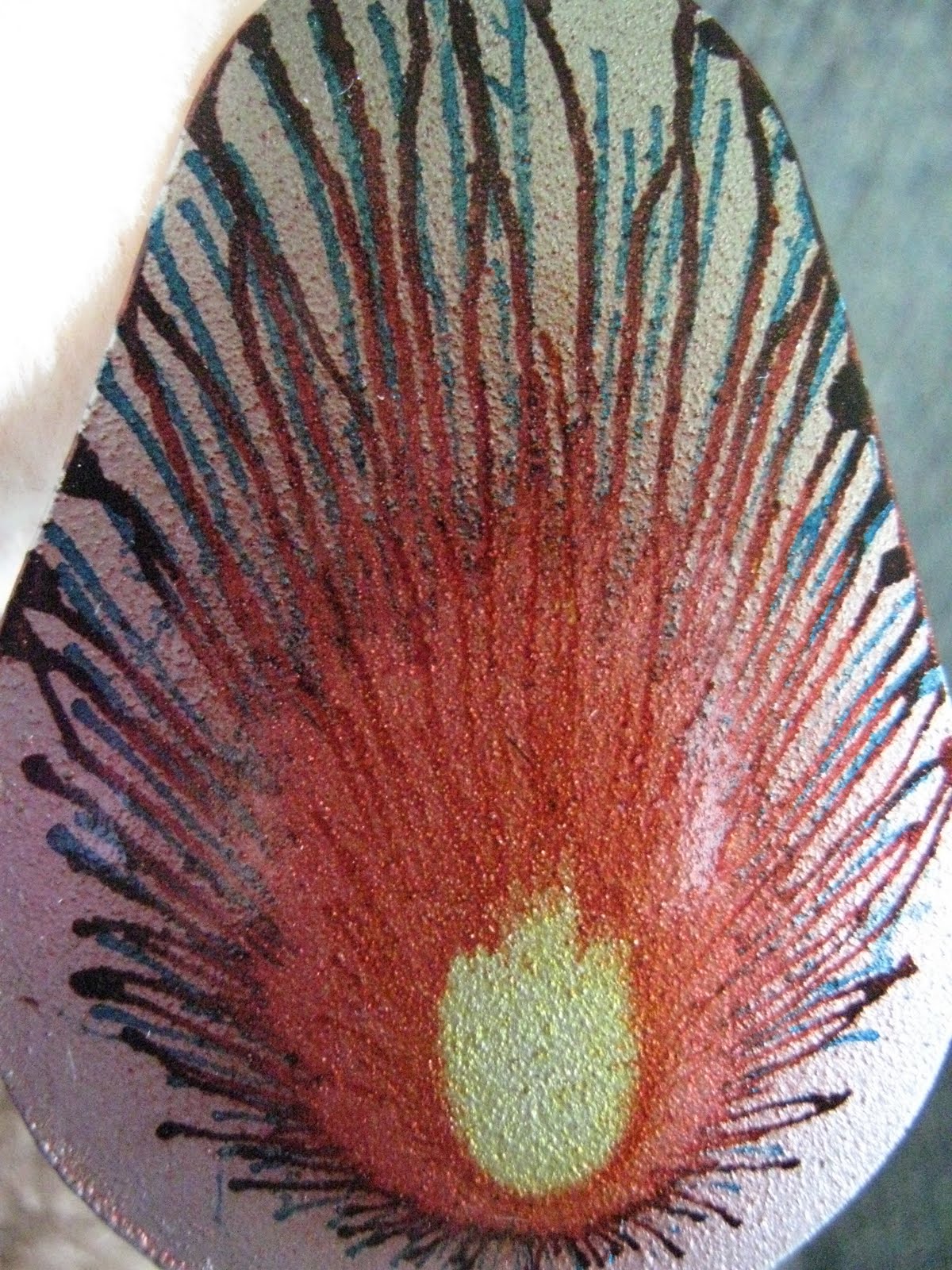
Something shiny.
There were also photos, drawings, and a mad installation/performance by Kent Monkman, a mixed-Cree artist who dresses in drag. Either of those qualities would be enough to win my adoration, but together... yes... sniff that colonial foot.